For Activity 01 of the Data Science Learning Club I wrote this post outlining how I selected life expectancy at birth data from the World Bank for years 2000 to 2015 as the dataset I would explore for the first few learning club activities. I also cleaned the data, gave an introduction to life expectancy and the questions I wanted to answer throughout the project, and evaluated descriptive data.
In the present post I will outline Activity 02, for which I created visuals that will help me explore the life expectancy at birth dataset further and gain a better understanding of the dataset. In Part One of the current activity I learned how to create nice looking interactive visualizations using Tableau Public. In Part Two of this activity I learned how to code my own charts using matplotlib.
Part One: Visualization with Tableau Public's Interactive Vizzes I created 6 visualizations with Tableau to help answer questions such as: How has life expectancy at birth changed from 2000 to 2015? How does life expectancy at birth differ between countries and between regions? How has the distribution of yearly life expectancy at birth data changed from 2000 to 2015? How does change in life expectancy at birth from 2000 to 2015 differ between countries and between regions?
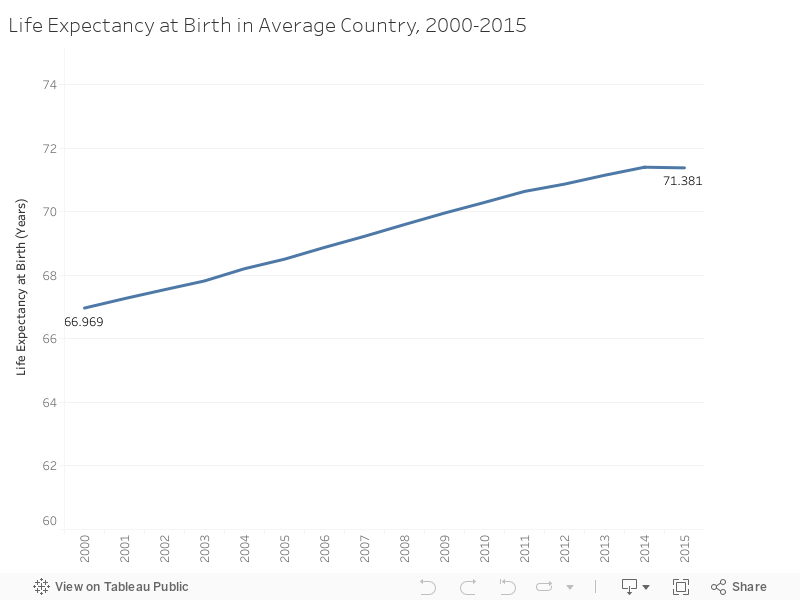
How has life expectancy at birth changed for the average person in the average country during the period of 2000 to 2015? Looking at the line chart below, we can see that life expectancy at birth for the average person in the average country has increased from 66.97 years in 2000 to 71.38 years in 2015, an increase of 4.41 years in life expectancy at birth over this 15 year time period.
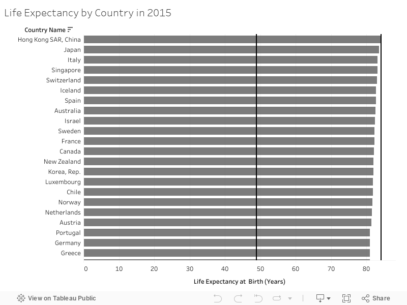
How does life expectancy at birth differ between countries in 2015? I've included a bar graph below to show the mean life expectancy at birth in 2015 for each of the 193 countries/economies with 2015 data currently available. In this graph we can see that there are huge disparities in mean life expectancy at birth between countries, ranging from 48.87 years in Swaziland to 84.11 years in Hong Kong SAR, China. Solid black Maximum and Minimum lines run down through the bars in the graph to aid in visualizing just how extensive the difference is between countries with high versus low life expectancies at birth.
How does life expectancy at birth differ between regions in 2015? The symbol map below shows life expectancy at birth for 193 countries in 2015, using a black-red diverging color scheme. In this map, the closer to black a bubble is, the lower the life expectancy in the corresponding country, and the closer to dark red, the higher the life expectancy in that country.
Clearly, the most striking observation from looking at this map is just how huge the disparity is in life expectancy at birth in Africa compared to the rest of the world.

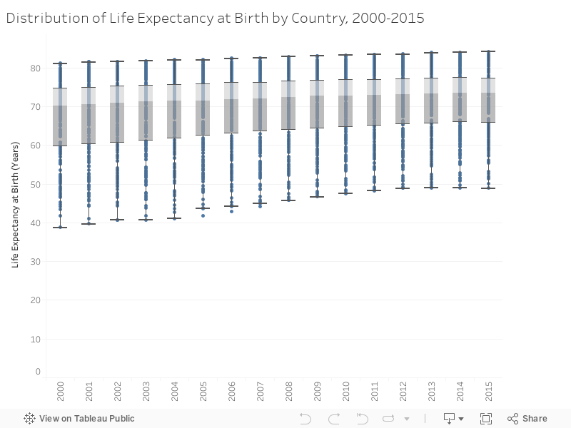
How has distribution of life expectancy at birth data changed during the period of 2000 to 2015? The next chart shows box-and-whisker plots for each year from 2000 to 2015. Box-and-whisker plots are valuable for answering questions such as: What is the spread of life expectancy at birth data? Where within this range do most life expectancy at birth values sit? What is the median value?
For each box-and-whisker plot, the bars (whiskers) that stick out of the box show the spread of the data. Looking at the box in each box-and-whisker plot, the line through the box (where the color changes from light grey to dark grey) is the median, the point at which half of the life expectancy at birth values are below and half above, and the Upper Hinge (top of the box) and Lower Hinge (bottom of the box) are the 75 and 25 percentiles, respectively.
The most interesting and encouraging thing I take away from this chart is that while the value of the Upper Hinge increased by 2.61 years from 2000 to 2015, the value of the Lower Hinge increased by a staggering 6.01 years during the same time period. This means that life expectancy at birth has been increasing more than twice as quickly in the lowest 25 percent of countries compared to the highest 25 percent, and thus disparities between countries have been decreasing (although clearly huge disparities do still exist).
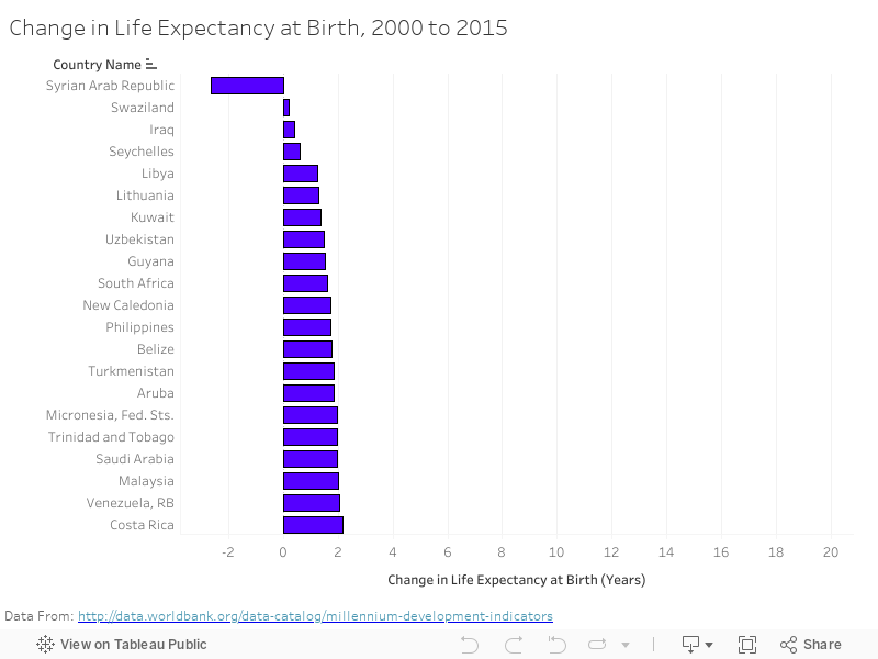
How does change in life expectancy during 2000-2015 differ between countries? For the next two charts I will be comparing data from 2000 and 2015 to evaluate changes in life expectancy at birth by country and region during that 15 year period.
Of the 200 countries included in the dataset, 8 were missing data for either 2000 or 2015. For these 8 countries I used that country's life expectancy at birth for the closest available year. More specifically, I used 2000 and 2014 for Bermuda , Faroe Islands, Kosovo, Liechtenstein, and St. Martin (French part), 2002 and 2015 for Seychelles, 2000 and 2012 for Greenland, and 2000 and 2011 for San Marino.
In the bar graph below we can see that:
Life expectancy at birth increased in 199 of 200 countries between 2000 and 2015.
In Malawi, Zimbabwe, Zambia, Rwanda, Botswana, and Tanzania, life expectancy at birth increased by more than 15 years.
Syria was the only country to experience a decrease in life expectancy at birth, with a decrease of 2.63 years.
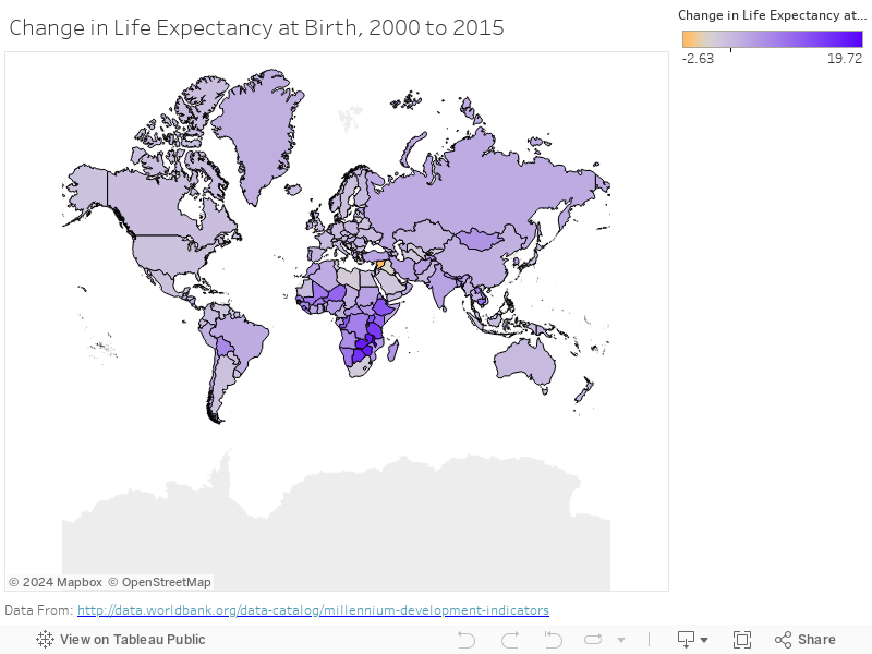
How does change in life expectancy during 2000-2015 differ between regions? In the filled map below, countries colored purple experienced an increase in life expectancy at birth from 2000 to 2015, with darker shades of purple representing larger increases in life expectancy. Countries colored in orange experienced a decrease in life expectancy.
We can see that:
The only country in orange (decreased life expectancy) is Syria.
The dark purple shaded countries are all located in Africa, representing the massive increase in life expectancy throughout this continent from 2000 to 2015.
Part Two: Coding Visualizations with Matplotlib
In Part Two I learned how to code charts myself using matplotlib, the python 2D plotting library. I have included four charts below and the corresponding code for each chart. Charts include a histogram for 2000, histogram for 2015, box-and-whisker plots for each year from 2000 to 2015 (similar to the box-and-whisker created above with Tableau), and a line plot comparing life expectancy at birth in Canada and the United States during 2000 to 2015 (click charts for expanded view).
Histogram of Life Expectancy at Birth in 2000:
These histograms for 2000 and 2015 show the shift in life expectancy at birth away from the bins for low values and towards bins for high values. The number of countries with a mean life expectancy at birth below 65 years decreased from 66 in 2000 to 46 in 2015. The number of countries with a mean life expectancy at birth above 75 years increased from 47 in 2000 to 74 in 2015.
Looking at both histograms, we can see that in 2000 and in 2015 life expectancy at birth data follows a continuous distribution with a negative skew.
 import pandas as pd
 import matplotlib.pyplot as plt

 histo2000 = pd.read_csv('C:/Users/Jamiee0613/Documents/life_exp2000.csv')
 plt.figure(figsize=(12, 9))
 histo_graph = histo2000.hist(bins=20,facecolor='green', alpha=0.50)

 plt.xlabel('Country Mean Life Expectancy at Birth (Years)')
 plt.ylabel('Frequency')
 plt.title(r'Histogram of Life Expectancy in 2000: $\mu=66.97$, $\sigma=10.18$')
 plt.xlim(35, 85)
 plt.xticks(range(35,86,5))
 plt.show(histo_graph)

 import pandas as pd
 import matplotlib.pyplot as plt

 histo2015 = pd.read_csv('C:/Users/Jamiee0613/Documents/life_exp2015b.csv')
 plt.figure(figsize=(12, 9))
 histo_graph2 = histo2015.hist(bins=20,facecolor='green', alpha=0.50)

 plt.xlabel('Country Mean Life Expectancy at Birth (Years)')
 plt.ylabel('Frequency')
 plt.title(r'Histogram of Life Expectancy in 2015: $\mu=71.38$, $\sigma=8.33$')
 plt.xlim(35, 85)
 plt.xticks(range(35,86,5))
 plt.show(histo_graph2)

Although I already did box-and-whisker plots with Tableau (above), I also coded my own box-and-whisker plots as a learning activity.
 import pandas as pd
 import matplotlib.pyplot as plt

 life_exp_count = pd.read_csv('C:/Users/Jamiee0613/Documents/life_exp_millen.csv')
 life_exp_count.plot.box()

 plt.ylabel('Life Expectancy at Birth (Years)')
 plt.xlabel('Year')
 plt.title(r'Boxplots of Life Expectancy for 2000 to 2015')
 plt.ylim(30, 90)
 plt.show()

 import pandas as pd
 import matplotlib.pyplot as plt

 life_exp_count = pd.read_csv('C:/Users/Jamiee0613/Documents/life_exp_countries_canusa3.csv')
 ax = life_exp_count.plot.line(x='Year', y='Canada', color='Red', label='Canada')
 life_exp_count.plot.line(x='Year', y='United States', color='Blue', label='United States', ax=ax)

 plt.title(r'Life Expectancy in Canada and United States, 2000- 2015')
 plt.ylabel('Life Expectancy at Birth (Years)')
 plt.ylim(75, 83)
 plt.yticks(range(76,83,1))
 plt.xlim(2000, 2015)
 plt.xticks(range(2000,2016,3))
 ax.legend(loc=4)
 plt.show()

I found that the most valuable component of Activity 02 was visualizing data on the world maps, as this helped me get a clearer understanding of disparities in life expectancy at birth between regions than what I had after evaluating descriptive data alone in Activity 01. In Activity 03 I will be using this same life expectancy at birth data to practice asking "business" questions, using data to answer them, and communicating those results to non-data-scientists.
No comments:
Post a Comment